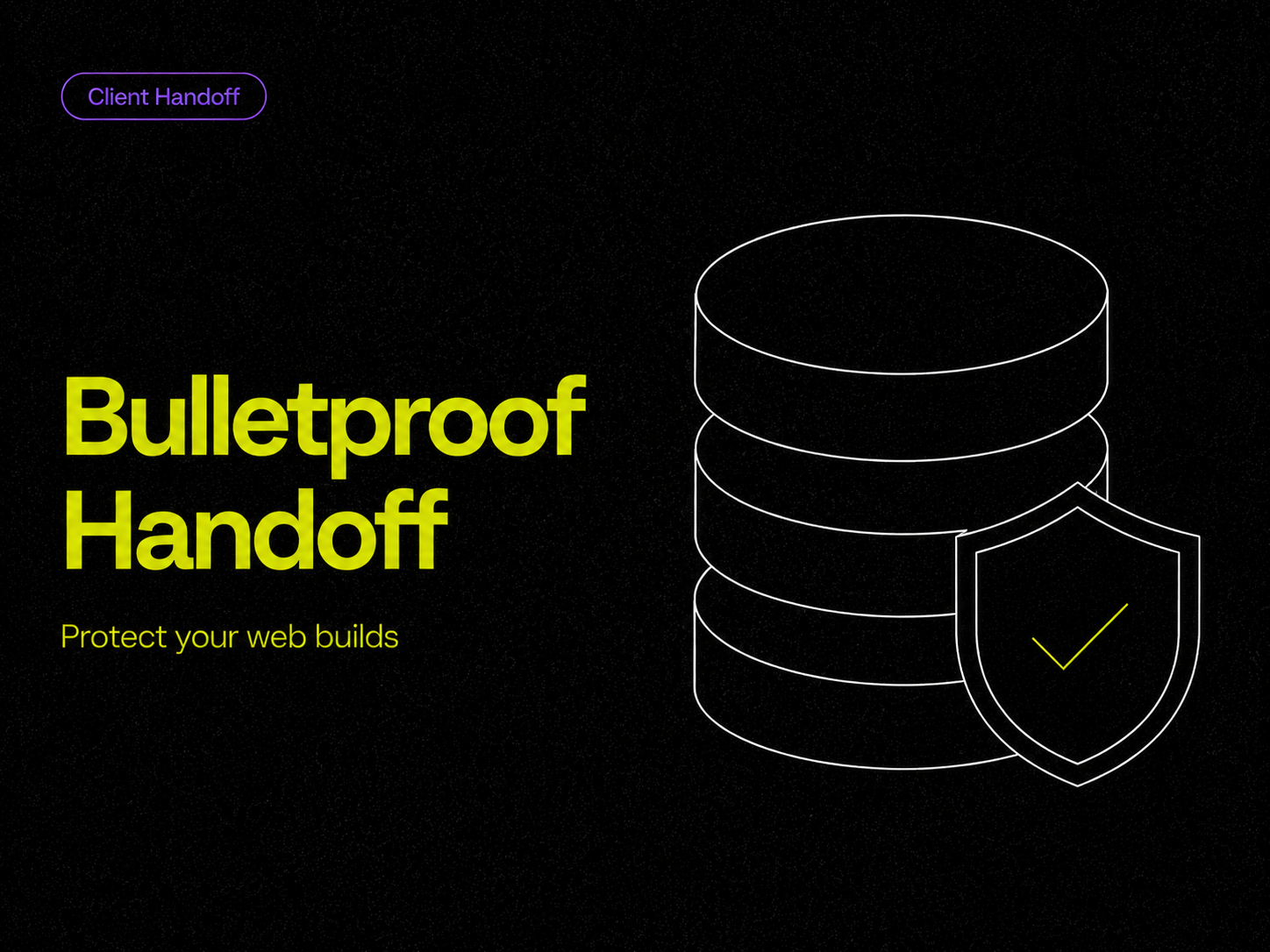
The Bulletproof Client Handoff Framework
Protect your builds from human error. Here is how to keep clients from estroying your design.
High traffic means nothing if users bounce. The psychological structure that turns visitors
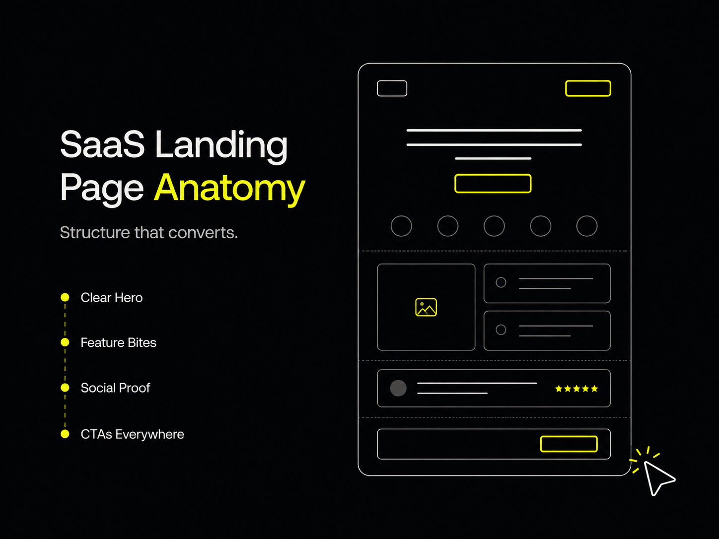
You can build the greatest software in the world, but if your landing page structure is wrong, you won't convert a single user.
Many founders assume that if an app has enough features, it will sell itself. As a result, they build landing pages that read like technical manuals rather than compelling sales pitches. At Oversight, we've designed enough high-converting pages to know that user psychology always beats a raw feature list.
If your SaaS landing page is suffering from high bounce rates and low sign-ups, here is the exact playbook to fix your structure and start converting traffic.
The hero section—the very top of your page before the user scrolls—is where you win or lose the game. Most founders make their hero sections entirely too messy. If a user doesn't understand exactly what you do within three seconds, they will leave.
Here are the absolute biggest conversion killers we see in SaaS hero sections:
Founders love to list 100 boring technical features. Don't do this. Even if your app does a million things, overwhelming the user with a giant bulleted list is a guaranteed way to make them stop reading.
Look at how Apple markets a phone. They don't just list the camera specs; they dedicate an entire, highly engaging section to making that one specific feature stick in your mind forever.
Everyone knows they need testimonials, but most people bury them at the absolute bottom of the page. By the time the user scrolls down there, they've already made up their mind.
Social proof shouldn't be an afterthought; it should be with the user at every step of the journey.
Your Call to Action (CTA) needs to be omnipresent without being annoying. If a user suddenly decides they are ready to buy while reading about feature number three, they shouldn't have to scroll all the way back to the top to find the checkout button.
Designing a layout that perfectly balances hierarchy, bento grids, scattered social proof, and aggressive (but clean) CTAs takes a lot of trial and error.
If you want to skip the wireframing phase and launch a page that is mathematically designed to convert, you don't have to build it from scratch.
Our most loved, highest-converting release is the Matte template. It has all of these psychological elements, bento grids, and CTA structures already baked into the design.
Preview and get the Matte template here to launch your high-converting landing page this weekend.
Powerful, self-serve product and growth analytics to help you convert, engage.

Let's bring your vision to life with standout design and expert development. Reach out to start building something exceptional together!


