The Bulletproof Client Handoff Framework
Protect your builds from human error. Here is how to keep clients from estroying your design.
Stop breaking layouts. Learn how locking in typography and color variables first cuts development time in half.
Moving a static Figma design into a fully interactive Webflow project is where most development timelines fall apart. The transition from a flat canvas to a responsive, breathing website often becomes a chaotic mess of disconnected classes and broken mobile layouts.
At Oversight, the secret to turning designs into flawless, scalable Webflow builds isn't just about coding faster—it's about setting up a rigid, predictable foundation before a single div block is placed on the canvas.
Here is the exact style guide and variable system we use to cut Webflow development time in half.
The biggest mistake developers make when moving from Figma to Webflow is winging the spacing and sizing.
People often eyeball the actual sizing of fonts, button paddings, and margin pixels. This leads to inconsistent designs that break as soon as the screen size changes.
The Solution: The absolute first step in any Webflow build should be a hard audit of the Figma file. Export every single image and vector asset you will need, and proceed to upload them into Webflow immediately. Getting your assets organized prevents you from breaking your flow state later when you are deep into the build.
You should never start building out your pages until your Webflow Variables are completely locked in. Setting up all colors, font sizes, and spacings globally ensures that when a client inevitably asks to change the primary brand color, you can update it in one click instead of hunting through 50 different classes.
Here is a breakdown of a professional variable architecture:
Instead of styling headings manually, create a fluid typography system. Define your base fonts (like 42 Dotsans) and set up responsive sizing for every breakpoint (Desktop, Tablet, Mobile L, Mobile P).
Never use raw hex codes on a Webflow element. Group your colors by function, not just by their visual hue.
Static Figma files don't show the magic of the web. The interactive leap is what makes a site feel premium, but there is a fine line between elegant and overwhelming.
The trick is to be as smooth as possible without becoming visually noisy. Never use linear animation curves. Linear curves feel robotic and cheap. Instead, rely heavily on the Out Expo easing curve. It creates a snappy start that gracefully decelerates, making it the perfect mathematical curve for button hover states and initial page-load animations.
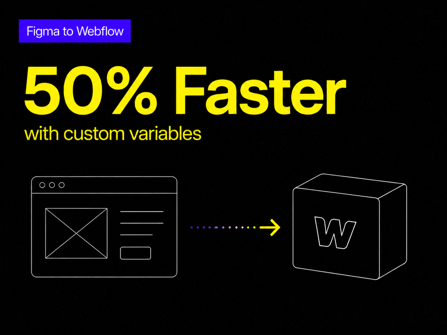
Why go through all this setup? Because having these variables already configured cuts the development time of starting a normal project by about 50%.
Since every font size (Heading 1 through 6, and Paragraphs L, M, S) and every color token is pre-linked, you can start dragging in layout elements and typing right away. You never have to worry about the base styling again. And if you need a systemic change, altering the root variable updates the entire project instantaneously.
Building this style guide architecture from scratch takes hours of tedious data entry. If you want to skip the setup and start building immediately, this exact variable system is baked into our premium Webflow templates.
Our most recent releases, Wings and Daylight, come pre-loaded with this exact typography, color, and spacing architecture. You can start dragging, dropping, and launching without ever worrying about messy classes or broken mobile padding again.
Powerful, self-serve product and growth analytics to help you convert, engage.

Let's bring your vision to life with standout design and expert development. Reach out to start building something exceptional together!