The Bulletproof Client Handoff Framework
Protect your builds from human error. Here is how to keep clients from estroying your design.
Learn the essential website structure consultants, coaches, advisors, and personal brands need to build trust, explain services clearly, and turn visitors into leads.

A strong consulting website does not need to be complicated. It needs to be clear.
Most consultants, coaches, advisors, freelancers, and personal brands do not lose visitors because their website lacks fancy effects. They lose visitors because the website does not answer the most important questions fast enough:
What do you do?
Who do you help?
Why should someone trust you?
What should they do next?
That is the real job of a consulting website.
After building many Webflow and Framer templates for service-based brands, we have noticed one pattern: the best websites are not always the loudest or most complex. They are the ones that make the offer easy to understand, make the person or company feel credible, and guide visitors toward a simple next step.
In this guide, we will break down the website structure consultants, coaches, advisors, freelancers, and personal brands should use to build trust and turn visitors into leads.
A lot of consulting and coaching websites feel generic.
They usually have the same vague hero section, the same stock photos, the same “we help businesses grow” headline, and the same long paragraphs that do not say much. The problem is not only design. The problem is clarity.
A visitor should not have to work hard to understand your value.
When someone lands on your website, they are usually asking themselves:
“Is this person relevant to me?”
“Can they solve my problem?”
“Do they look trustworthy?”
“Have they done this before?”
“How do I contact them?”
If your website does not answer those questions quickly, the design can look beautiful and still underperform.
For consultants and coaches, trust is the product before the service is ever sold. Your website needs to create that trust before the first call.
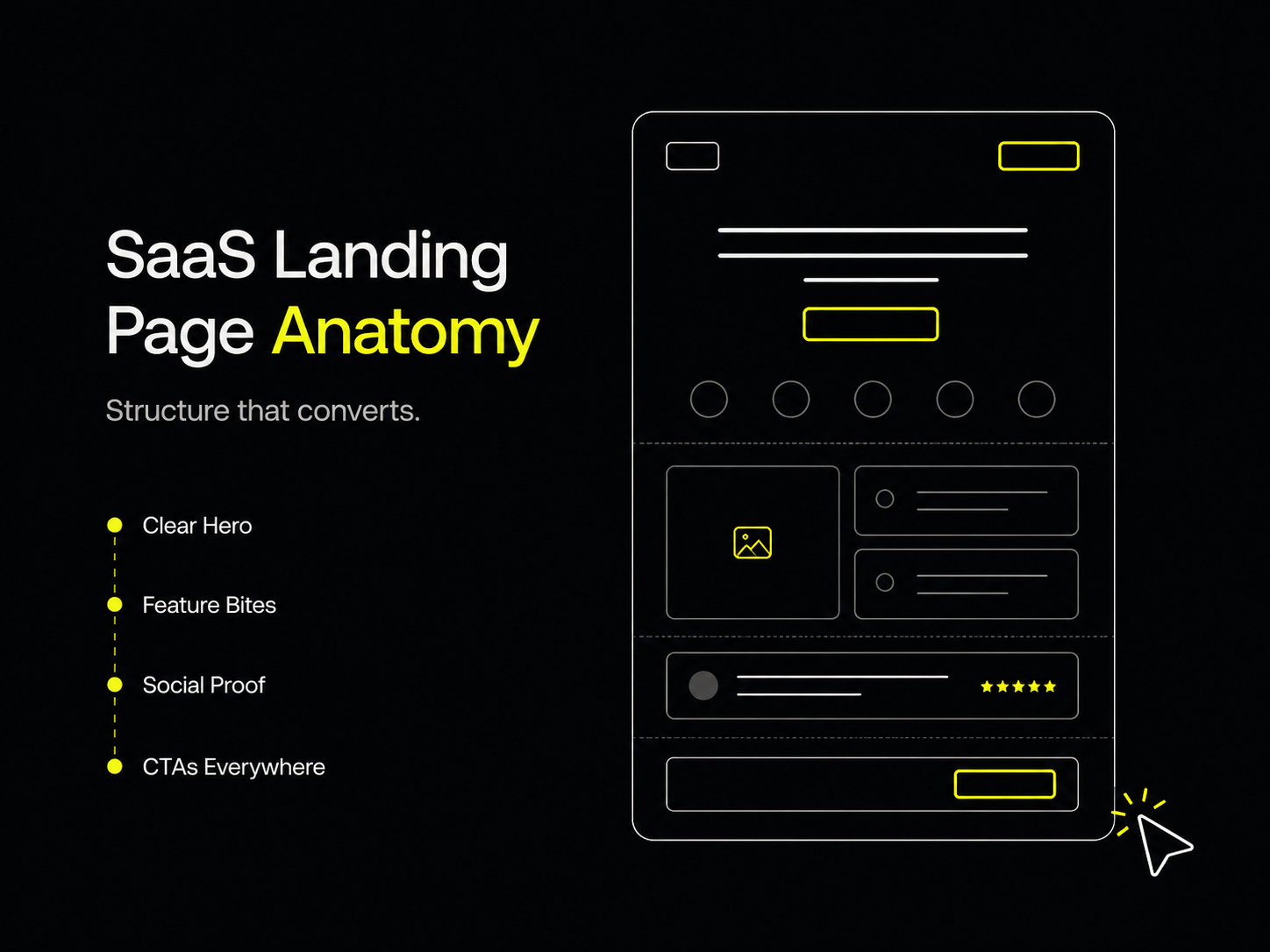
Your homepage should work like a guided sales conversation. It should introduce the offer, explain the value, show proof, and make the next step obvious.
Here is a simple homepage structure that works well for most consultants, coaches, and personal brands.

The hero section should explain who you help and what outcome you create.
Avoid vague headlines like:
“Helping you unlock your potential.”
That may sound nice, but it does not tell the visitor enough.
A stronger version would be:
“Strategic coaching for founders who want to lead better, hire smarter, and scale with more clarity.”
That instantly tells us who it is for, what the service is, and what kind of result the visitor can expect.
A good hero section should include:
For consultants, the CTA should usually be something like “Book a call,” “View services,” or “Start here.”
After the hero section, visitors need a reason to believe you.
This section can introduce your background, point of view, niche, or the type of clients you work with. It does not need to be long. It just needs to make the visitor feel like there is a real person or expert behind the website.
For example:
“At Over Sight, we design premium Webflow and Framer templates for founders, agencies, consultants, and service-based brands that need polished websites without starting from scratch.”
That kind of sentence works because it is specific. It explains what the brand does, who it helps, and how.
Your services should be easy to scan.
Do not hide your offers inside long paragraphs. Break them into clear cards or sections. Each service should explain:
For example:
Positioning Strategy
For consultants and founders who need a clearer offer, sharper messaging, and a stronger market position before launching their website.
That is much stronger than simply writing “Strategy.”
Consulting websites need proof.
Proof can come in different forms:
Not every consultant has huge case studies. That is okay. If you do not have big results yet, use process-based trust instead.
Show how you work. Explain your method. Share your thinking. Give visitors a reason to believe you have a clear approach.
A process section makes your service feel easier to buy.
People are often nervous before contacting a consultant because they do not know what happens next. A simple process section removes that uncertainty.
Example:
Step 1: Discovery
We understand your goals, audience, offer, and current website problems.
Step 2: Strategy
We define the structure, messaging, and visual direction.
Step 3: Build
We design and develop the website in Webflow with responsive layouts and clean interactions.
Step 4: Launch
We test the site, connect the tools, and prepare everything for launch.
This makes the experience feel professional and predictable.
A blog is especially useful for consultants, coaches, and personal brands because it shows how you think.
Visitors may not contact you immediately. But if your articles answer the questions they are already searching for, your blog can build trust before they ever book a call.
Good blog topics for consultants include:
A blog also gives your website more long-term search potential. Instead of relying only on your homepage, every useful article becomes another entry point into your brand.
The bottom of the homepage should not just fade out.
End with a clear next step.
For example:
“Ready to build a consulting website that feels premium, clear, and easy to trust?”
Then add one button:
“Book a call”
or
“View the template”
A strong CTA should feel natural, not desperate.
A homepage is not enough for most service-based brands. A proper website should give visitors enough context to trust you before they reach out.
Here are the core pages we recommend.
Your homepage should give visitors the full overview: what you do, who you help, why you are credible, what services you offer, and how to contact you.
Think of it as the main sales page for your brand.
The About page is not just a biography. It should explain your story, your expertise, your values, and why your approach is different.
For personal brands, this page matters a lot. People are often buying your thinking, your taste, your experience, and your ability to guide them.
A strong About page should include:
The Services page should explain your offers in more detail.
Each service should be clear enough that the visitor understands whether it is relevant to them. Avoid using clever names without explaining what they mean.
A simple service page structure:
A blog helps consultants build authority.
It gives you a place to publish useful articles, answer common client questions, and show your expertise. For search, it also gives your site more chances to appear for specific problems your audience is researching.
Your Contact page should make it easy for the visitor to take action.
Include:
Do not make people hunt for a way to reach you.
Legal pages are often ignored, but they make a website feel more complete and professional.
At minimum, many websites include:
The exact legal requirements depend on your business, location, tools, and audience, so it is worth getting proper legal guidance if you collect personal data or run paid services.

Premium design is not only about visuals. It is about confidence.
A premium consulting website usually has:
The goal is not to add more decoration. The goal is to make the brand feel intentional.
For consultants and coaches, this matters because the website becomes part of the first impression. Before someone reads every detail, they already feel whether the brand looks credible, modern, and worth contacting.
That does not mean every consulting website should look the same. A leadership coach, a fractional CMO, a business advisor, and a creative strategist may all need different styles. But they all need the same foundation: clarity, trust, and a simple path to action.
Webflow is a strong option for consultants, coaches, advisors, freelancers, and personal brands because it gives you design flexibility without forcing every update to become a development task.
For service-based websites, that matters.
You may need to update your services, publish blog posts, change testimonials, improve your CTA, add a landing page, or adjust your messaging as your offer evolves. A flexible visual platform makes those changes easier to manage.
For consultants who care about brand perception, Webflow also allows for polished layouts, responsive design, animations, CMS content, and custom visual systems without the site feeling locked into a generic theme.
The best website platform is the one that lets you keep improving your website as your business grows.
If you want to skip the blank canvas, we built Wings as a premium Webflow template for consultants, coaches, advisors, freelancers, and personal brands.
Wings is designed for service-based websites that need to feel clean, modern, and memorable without becoming overly complicated.
It includes:
The goal of Wings is simple: give consultants and service-based brands a strong website foundation without forcing them to design everything from zero.
It works well for:
Wings is especially useful if you want a website that feels more refined than a basic landing page, but you still want something practical, editable, and ready to adapt.
You can view Wings on the Webflow Marketplace here:
https://webflow.com/templates/html/wings-website-template
Before launching a consulting or coaching website, use this checklist:
If the answer is yes to most of these, your website is already ahead of many service-based brands.
A great consulting website does not need to be loud. It needs to be clear, trustworthy, and easy to act on.
Your website should help visitors understand your value before the first call. It should show your thinking, explain your services, build confidence, and make the next step obvious.
For consultants, coaches, advisors, freelancers, and personal brands, the best website structure is the one that supports trust.
That means clear messaging, strong sections, useful pages, proof, responsive design, and a simple contact flow.
If you want a faster starting point, Wings gives you that structure inside Webflow with a clean premium design, CMS blog setup, responsive pages, legal pages, and polished animations already included.
View Wings on Webflow Marketplace:
https://webflow.com/templates/html/wings-website-template
Powerful, self-serve product and growth analytics to help you convert, engage.

Let's bring your vision to life with standout design and expert development. Reach out to start building something exceptional together!